Study Dashboard
The Study Dashboard is a filterable popup that summarizes your Incremental, Dismissed, and Flashcard activity across the whole knowledge base or scoped to a single document, with a fully expandable hierarchy view showing time, reps, retention, and speed at every level of your rem tree.
It was inspired by the Statistics Plugin (period filters and context selector) and combines those controls with data from the existing Aggregated Repetition History and Practiced Queues History widgets.
What it shows
Below the Context / Period box the popup has two tabs. The filters live above the tabs, so whatever context and period you pick applies to both.
Summary & Hierarchy — two stacked sections:
- Summary — three rows (Incremental, Dismissed, Flashcards) plus a bold Total row, with columns for
Items,Items w/ Reps,Reps,Time, and (for Flashcards) average retention and speed. - Hierarchy — every top-level rem with activity in the selected period, expandable into the full ancestor tree. Each row shows total time, card reps + time, IncRem reps + time (sum of Incremental + Dismissed history), retention %, and speed in cards-per-minute.
Graphs — the same period plotted over time: reviews and time per bucket, plus retention, speed and the answer-grade split.
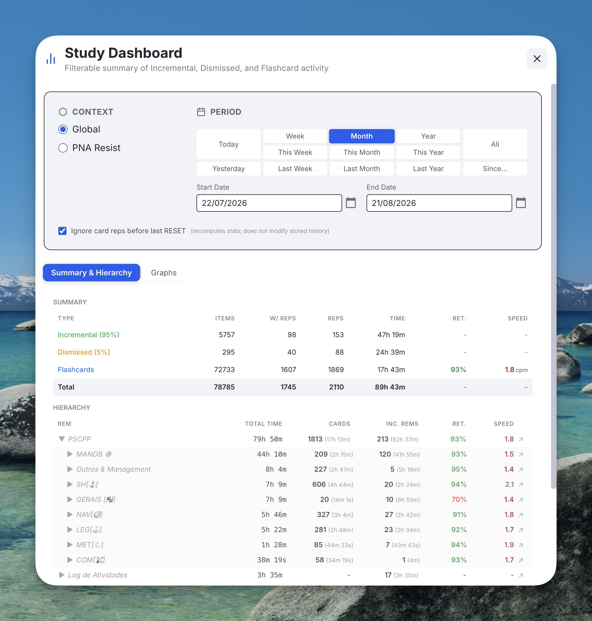
Opening it
- Command Palette: Open Study Dashboard (quick code
sdb) - The dashboard always opens in Global mode by default.
- If a rem is focused in the editor (or you're reviewing a card in the queue), the command passes it along as the Document-mode root — you can switch to Document inside the popup at any time. Without a rem context, the Document radio is greyed out and Global is the only option.
Filters
Context
- Global — every IncRem, Dismissed rem, and Card-bearing rem across the entire KB.
- Document — only rems in scope of the rem you opened the dashboard from. Two scope sub-modes:
- Descendants Only —
rootRemand every descendant viagetDescendants(). - Comprehensive — uses the same scope expansion as the rest of the plugin: descendants, rems in the same document/portal, folder-queue contents, source documents (recursively), referencing rems, PDF extracts and PDF descendants. See Prioritization & Sorting → Comprehensive scope for the full definition.
The Document option is greyed out if the dashboard was opened without any rem context.
Period
Twelve presets in a tidy 5×3 grid, plus an All button and explicit Start / End date inputs:
| Today | Week | Month | Year | All |
|---|---|---|---|---|
| Yesterday | This Week | This Month | This Year | |
| Last Week | Last Month | Last Year |
- Clicking a preset auto-fills both date inputs to the resolved range.
- Editing either date directly switches the picker to custom.
- All clears the inputs (no meaningful start date).
- Default on first open is This Year.
- Every boundary is your local midnight, so a range of
27/07→27/07covers exactly the day you lived through, matching what RemNote's own Flashcards → Stats heatmap reports for that date.
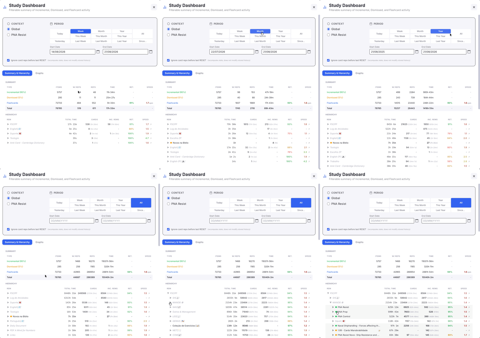
Switching preset re-aggregates immediately — the heavy load already happened, so Week → Month → Year → All only re-counts data held in memory (see Performance notes). The Summary and the whole Hierarchy redraw together, and branches pruned for having no reps in a narrow period re-appear as you widen it:
Summary section
| Column | Meaning |
|---|---|
| Items | Total rems tagged (or, for Flashcards, total cards) in the selected scope — period-independent. |
| w/ Reps | Subset of the above that had at least one repetition inside the period. |
| Reps | Total qualifying repetitions in the period. |
| Time | Total review time in the period. |
| Ret. | (Flashcards only) (reps − again-count) / reps, color-coded ≥90 % green / <80 % red / yellow. |
| Speed | (Flashcards only) Cards per minute — or seconds per card: click the column heading to switch, see Speed unit. Color-coded with a 1.5 → 4 cpm gradient in either unit. |
The percentages next to Incremental and Dismissed show each one's share of Incremental + Dismissed items.
The bold Total row sums Items / w-Reps / Reps / Time across the three types. Retention and Speed are not aggregated across types (they aren't meaningfully addable).
Filtering rules match the plugin's other authoritative-summary tooling:
- Cards count only when scored
AGAIN,HARD,GOOD, orEASY(RemNote'sTOO_EARLY,VIEWED_AS_LEECH,RESET,MANUAL_DATE,MANUAL_EASEare excluded). - IncRem reps count only for
rep,executeRepetition, andrescheduledInQueueevent types (rescheduledInEditor, manualDateReset, lifecycle markers are excluded). - Card response time is capped by the Flashcard response time limit setting (default 180 s). IncRem
reviewTimeSecondsis intentionally uncapped — an IncRem rep can legitimately span minutes of reading.
Hierarchy section
The hierarchy lists every rem with activity inside the selected period, organized as a collapsible tree:
- Top-level rows = rems whose parent is null or outside the scope. Sorted by total time descending.
- Click ▶ to expand a branch and reveal the full subtree under it. Children are sorted by total time descending too.
- Rems that are themselves Incremental or Dismissed get a colored dot (●) next to their name.
- Rems whose history carries review notes show a 📝 icon after the name — hover to read them (dated, newest first, capped at 8 with an overflow hint; open the Repetition History popup for the full list). All of the rem's notes are shown regardless of the selected period, so annotations never silently vanish when you narrow the filter.
- The ↗ icon on each row opens the rem in the editor (PDF-aware: PDF highlights/extracts open as a page).
- Branches with zero reps in the period are pruned at every level. If you change to All, more rems re-appear.
- Structural ancestor nodes — rems that have no own data but are needed to keep the tree connected — render in italics with reduced opacity. Their numbers are the bottom-up aggregate of their descendants.
The period demo above shows both halves of this: the tree re-counting as the period widens, and branches expanding level by level.
Each row's columns:
| Column | Meaning |
|---|---|
| Total Time | Card time + IncRem time, summed across the subtree (in the period). |
| Cards | Card reps in the period, with the time spent in parentheses. |
| Inc. Rems | IncRem reps including history of dismissed rems in the period, with time in parentheses. |
| Ret. | Retention across all cards in the subtree (in the period). |
| Speed | Review speed across the subtree, in the unit picked in the column heading. |
Global mode — top-level rems
In Global mode, a "top-level rem" is the highest ancestor (where parent === null) that has, anywhere in its subtree, at least one IncRem rep or card rep inside the selected period. Each top-level row's numbers are the bottom-up aggregate of everything beneath it.
Document mode — root
In Document mode the root row is the rem the dashboard was opened from (or its closest in-scope ancestor when in Comprehensive mode, see below).
Graphs tab
An alternative reading of the same numbers the Summary counts, spread over the timeline instead of collapsed into a single row — a drawn counterpart to the Practiced Queues History summary table (with one difference).
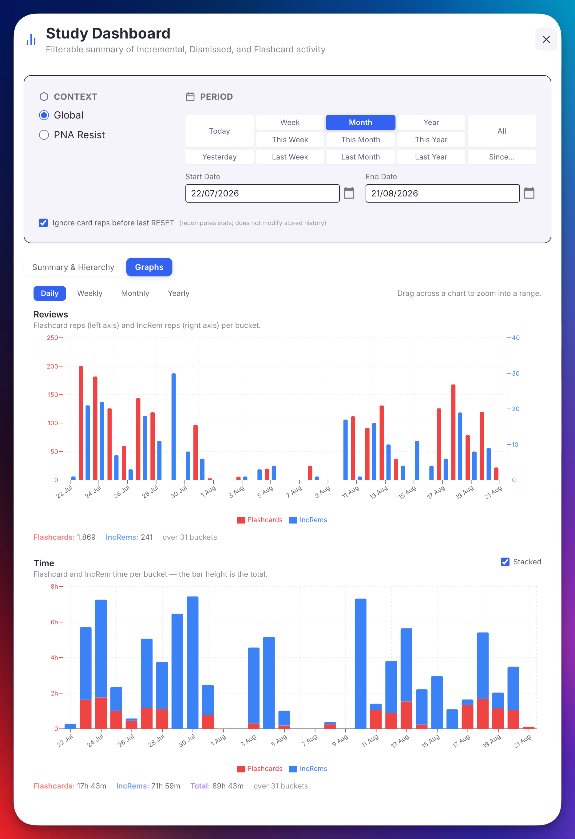
The five charts
| Chart | Left axis | Right axis | Mark |
|---|---|---|---|
| Reviews | Flashcard reps | IncRem reps (Incremental + Dismissed) | Bars |
| Time | Flashcard time and IncRem time — one shared scale | — | Bars, stackable |
| Retention | Retention % | Flashcard reps behind it | Line over faint bars |
| Speed | Cards per minute, or seconds per card | Flashcard reps behind it | Line over faint bars |
| Answer breakdown | Forgot / Hard / Easy % | Good % | Four lines |
The first two answer how much; the last three answer how well, and are the Summary section's Ret. and Speed columns — plus the grade split behind them — spread over time instead of collapsed into one number.
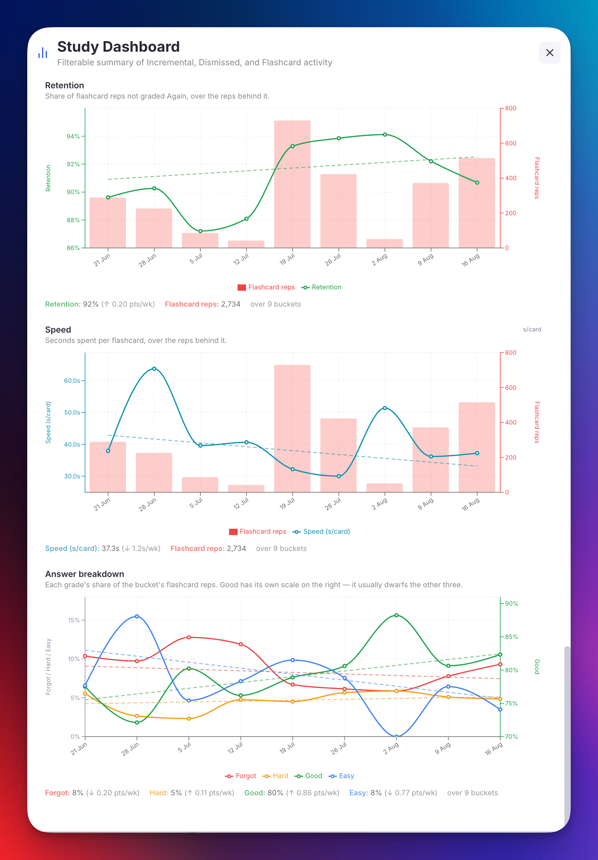
Why some charts use two scales. In a typical knowledge base flashcard reps outnumber IncRem reps by an order of magnitude, so on one axis the IncRem bars would flatten to nothing. The same applies to Good, which usually holds 80% of your answers while the other three grades share what's left. Times are comparable, so that chart keeps a single scale — which is also what lets it stack.
Why the rates are lines, not bars. Retention, speed and the grade shares are rates, not quantities that accumulate from zero; a bar would claim otherwise. For the same reason their axes are band-fitted — a retention living between 88% and 95% is drawn against that band, not against 0–100%, where every real movement would flatten into a straight line.
The faint bars behind Retention and Speed are the rep counts. 100% retention over 2 reviews and 92% over 300 look identical on a bare line; the volume behind each point is what makes it readable.
Buckets you didn't study are gaps, not zeroes. A week with no reviews has no retention and no speed — that is not the same as 0%, so the line breaks rather than diving to the floor and back.
Granularity
Daily / Weekly / Monthly / Yearly buckets the selected period along the x-axis. Weeks start on Sunday, matching the rest of the plugin's period maths.
Switching is instant: it re-groups data already in memory, it does not re-read the knowledge base. The totals under each chart don't move when you switch, because coarser buckets only regroup the same reps.
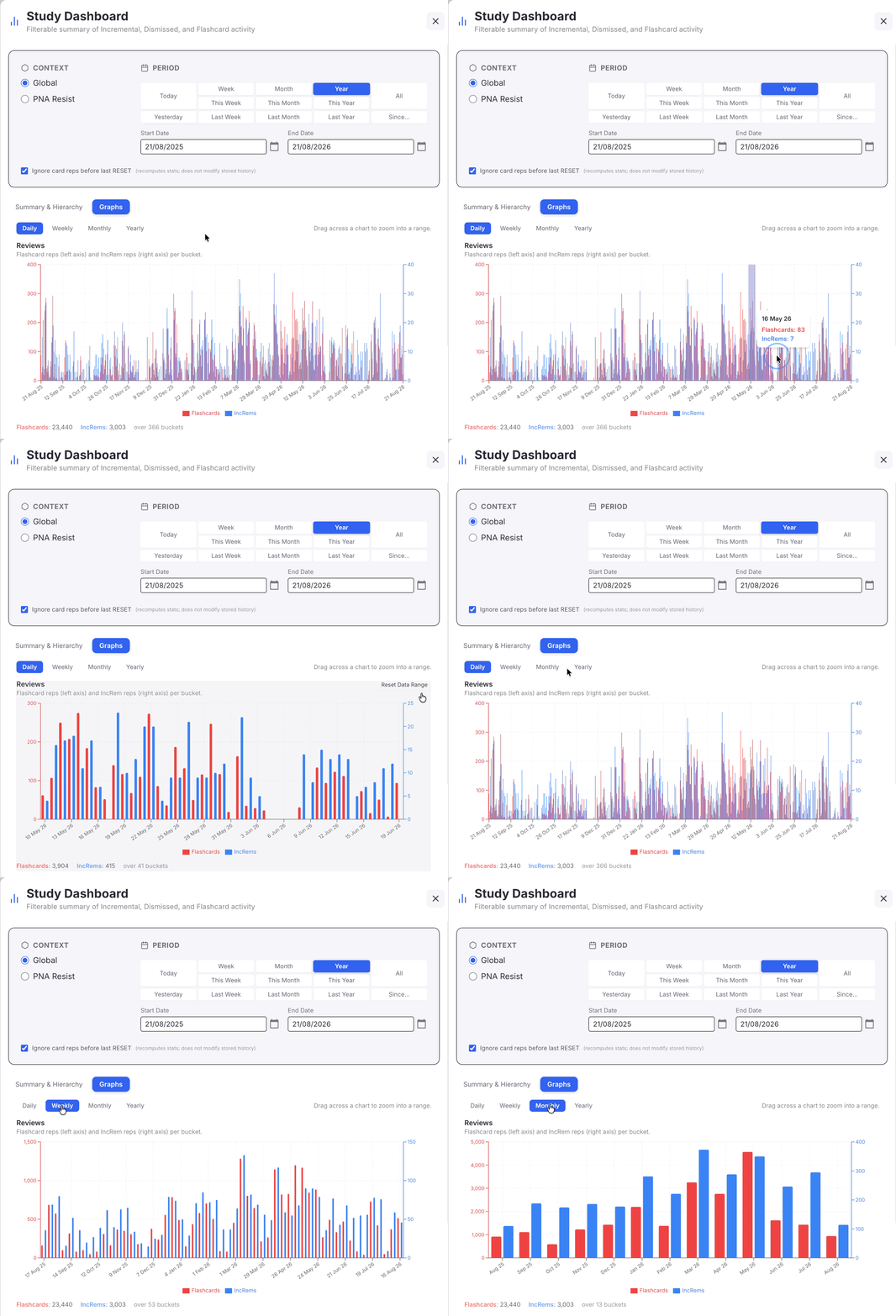
Days with no activity are drawn as zero bars, so the axis reads as a real timeline rather than a list of the days you happened to study. The span runs from your first to your last activity inside the period, so a half-finished year doesn't squeeze the bars that carry data into a corner.
If a period would produce more than 800 bars (say All at daily granularity), the chart steps down to the next coarser bucket and tells you it did.
Stacked vs. side by side
The Time chart carries a Stacked checkbox, on by default:
- Stacked — Flashcards and IncRems stack into one bar, so the bar height is the bucket's total time. No separate "total" mark is drawn, because it would be the same height twice.
- Unchecked — the two sit side by side on a shared baseline, which makes their evolution easier to compare, at the cost of the per-bucket total.
Either way the tooltip and the totals line below the chart report Flashcards, IncRems and Total. The y-axis ceiling follows the mode — the sum of the two series when stacked, the taller of the two when they're side by side.
The Reviews chart is always side by side: its two series live on different axes, so stacking them would mean nothing.
Speed unit
The Speed chart's header carries a cpm / s per card switch. It is the same preference the Practiced Queues summary table and this dashboard's own Speed columns use, so changing it in any one of them changes all three — one speed unit per device, not four.
In the Summary and Hierarchy tables the column heading itself is the switch: it reads Speed (cpm) or Speed (s/card) and toggles when clicked. The colour scale always runs off cards-per-minute, whichever unit is displayed — in seconds-per-card the good end is the low one, so colouring off the shown number would put red where green belongs.
Trend lines
A Trend lines checkbox next to the granularity buttons fits a straight line through Retention, Speed and each of the four grades, and reports its slope next to that series' figure — Retention: 92% (↑ 0.20 pts/wk). It is off by default: the data should be what you see first.
Three things about the fit are worth knowing:
- It is weighted by the reps behind each bucket. A bucket holding three reps cannot pull the line as hard as one holding eight hundred — otherwise the trend would contradict the reps-weighted figure printed right beside it.
- Buckets you didn't study are excluded, not counted as zero. A week off is not a week of total failure, and letting it in would drag every trend toward the floor.
- The slope is per bucket, in the granularity you're viewing: switch from weekly to monthly and
0.20 pts/wkbecomes the equivalent per-month figure.
Trends are drawn dashed, thinner and paler than the data, stay out of the legend, and never appear in the tooltip — on the Answer breakdown that is the difference between four lines and eight.
Zooming
Drag horizontally across any chart to zoom into that range. All five follow — they are five readings of one timeline — and a Reset Data Range button appears to return to the full period. This is the same interaction as the Priority Shield History graphs.
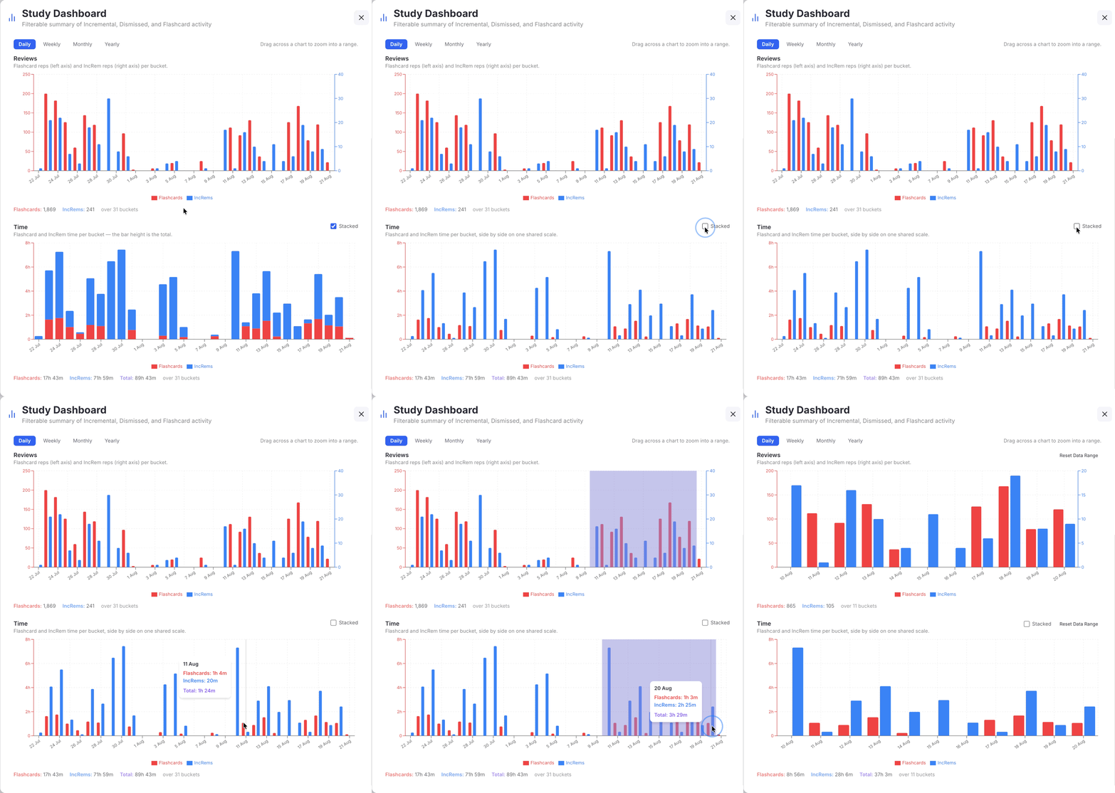
Every y-axis fits itself to the values currently on screen, zoomed or not, so the plot area is never wasted on empty headroom. That's the behaviour the Priority Shield graphs put behind an Optimize Priorities Zoom button, applied automatically here. Counts and times are fitted from a zero baseline; rates and percentages are fitted to a band around their own values, and a trend line that leaves that band widens it rather than being clipped.
The totals line under each chart reports what the visible range adds up to — so after zooming it describes the zoom, not the period.
What it counts
Exactly what the Summary section counts: the same qualifying rep types, the same handling of dismissed history (folded into IncRems), and the same Flashcard response time limit cap on card times. Unzoomed, the bars of any chart sum to the matching Summary cell.
Skips are excluded, as everywhere else in this plugin. RemNote's own weekly summary counts them in its 100%, so the same week reads a little differently here: shares are of graded reps only.
Rates are recomputed, never averaged. A week's retention comes from that week's summed reps, not from averaging its days — a day with 3 reps cannot outweigh a day with 300. The same holds for the figures in the totals line, which recompute over whatever range is visible.
That also means the graphs read rem repetition histories, the way the rest of this dashboard does — not the session records behind the Practiced Queues table. The two answer slightly different questions ("what has been reviewed", vs. "what happened in a queue session"), so small differences between them are expected. The advantage of reading histories is that the graphs honour the Context selector: switch to Document mode and they redraw for that document alone.
Your tab, granularity, Stacked and Trend lines choices are remembered on this device, alongside the period. The speed unit is remembered too, and shared with the rest of the plugin.
Global vs. Document
| Global | Document — Descendants | Document — Comprehensive | |
|---|---|---|---|
| Scope | Every IncRem, Dismissed, and card-bearing rem in the KB | rootRem.getDescendants() (inclusive of rootRem) |
Same as the rest of the plugin's comprehensive scope: descendants + portals + folder queue + referencing rems + sources (recursive) + PDF extracts/descendants |
| Roots in the hierarchy | All top-level KB rems with activity | The selected rem | Same — plus structural rems above when comprehensive expansion reached outside the rem's own subtree |
Comprehensive scope + hierarchy
The Comprehensive scope, by construction, can include rems whose parents are not themselves in the scope (e.g. a PDF extract belonging to a source document referenced from inside the document being analyzed). To keep the rendered tree connected and intelligible, the dashboard walks every in-scope rem's parent chain and materializes any missing ancestors as structural-only nodes — italic rows with no self-data, whose role is purely to give the tree a coherent shape from each leaf up to a real root.
The aggregate numbers on a structural node are the sum of its descendants — so even though the node has no reps of its own, it gives you a meaningful per-branch breakdown.
Performance notes
The dashboard's data load can be heavy on large knowledge bases. Several optimizations keep it manageable:
- Bulk fetching: at load time the dashboard issues a small fixed set of bulk calls —
taggedRem()for the Incremental, Dismissed, and cardPriority powerups, plus a singlecard.getAll()— instead of per-rem RPCs. Because the cardPriority powerup typically covers every card-bearing rem in a KB, those bulk calls provide freeparentandtextinfo for the vast majority of rems-with-data, so chain-walking needs almost zero additionalfindOnecalls. - Period changes are instant: the heavy data load happens once per session/scope. Switching the period reuses the cached data and performs only an in-memory aggregation pass — including the Graphs, which re-bucket in memory.
- Pre-built subtrees: in Global mode the per-top-level subtrees are assembled at load time from the cached parent chains. Expanding any top-level row is therefore instant, with no further RPCs.
- Parallel ancestor walks: ancestor chains are resolved in chunks of 50 with an in-flight promise cache, so sibling rems that share an ancestor path do that work only once.
- Progress bar: the popup shows a progress bar during loading (0–80 % for fetch, 80–100 % for aggregation) with a label so you can see what phase it's in.
- Filter changes during a load join it: changing period or context while the dashboard is still loading no longer restarts anything. A load in flight is shared, and its result is cached whichever filter you have landed on by the time it finishes — so the progress bar carries on from where it was instead of returning to zero.
When you change the context (Global ↔ Document) or scope (Descendants ↔ Comprehensive), the dashboard loads the relevant data set — once. Switching back to a context you've already loaded costs nothing, and neither does changing the period or the ignore-pre-RESET filter, which are aggregate-only.
Command
| Command | Quick Code | Description |
|---|---|---|
| Open Study Dashboard | sdb |
Opens the dashboard popup. Auto-detects the focused rem in the editor or the current card in the queue and uses it as the Document-mode root. If no rem context is available it opens in Global mode. |
📖 See Plugin Commands Reference for the full command list.